
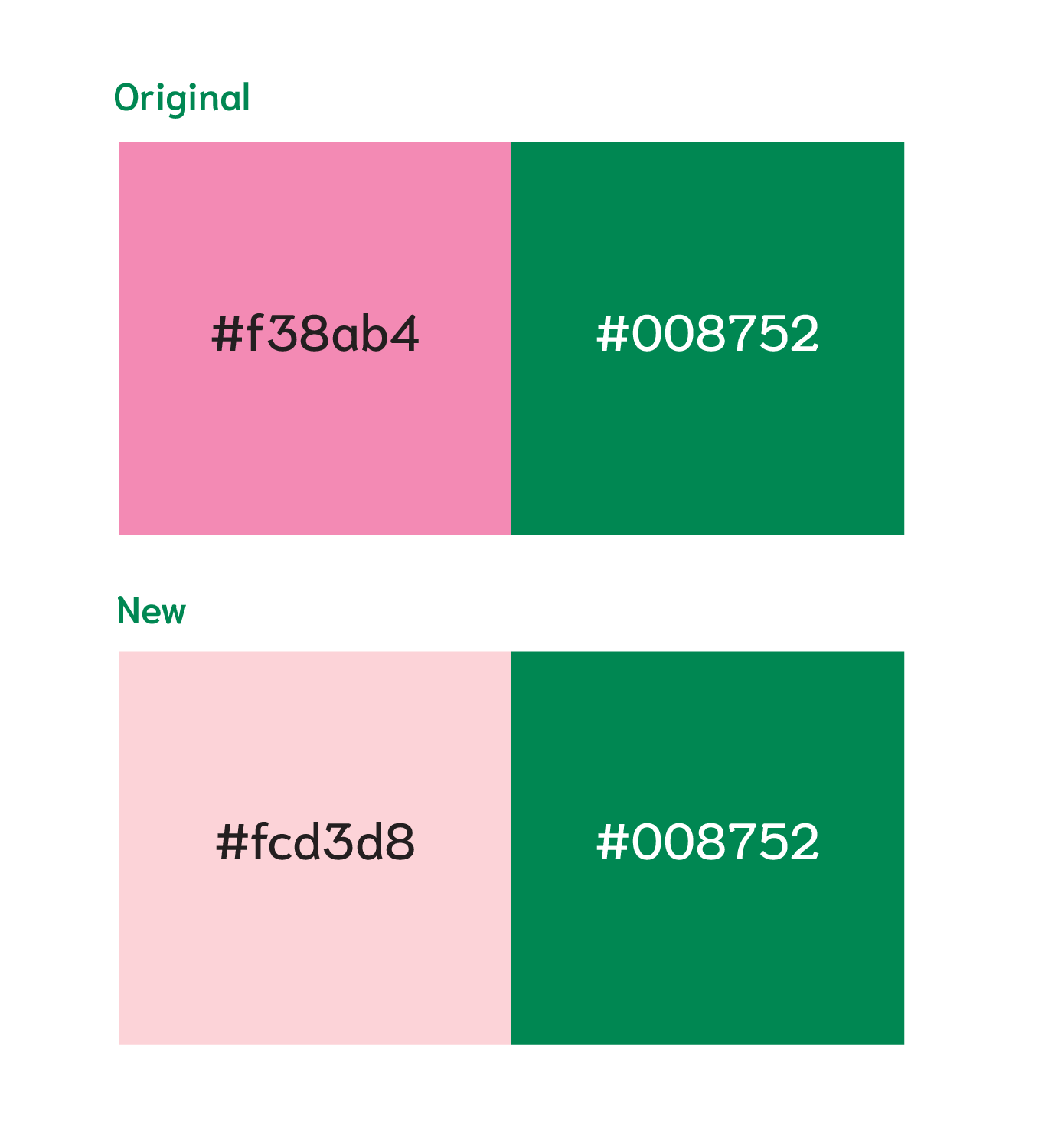
Color Palette
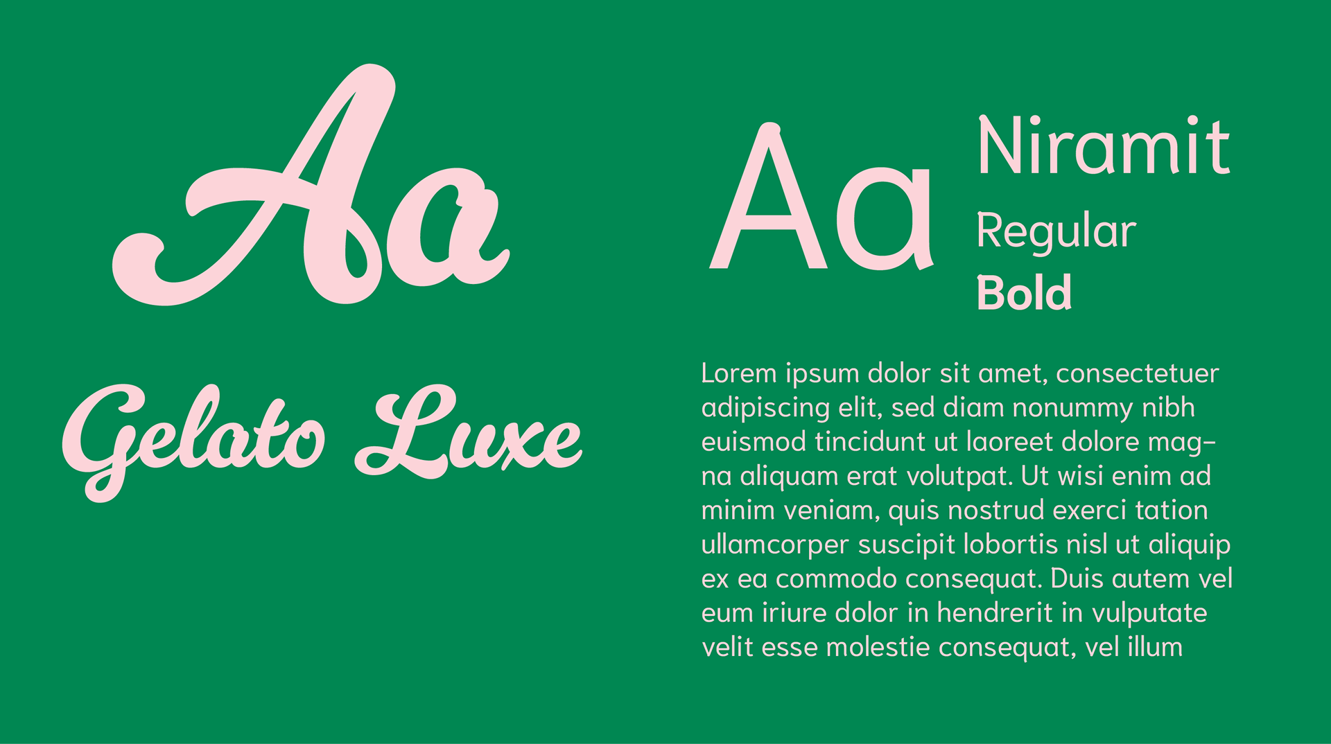
Fonts
Exploration
Final 3 Concepts
Wordmark & Brandmark
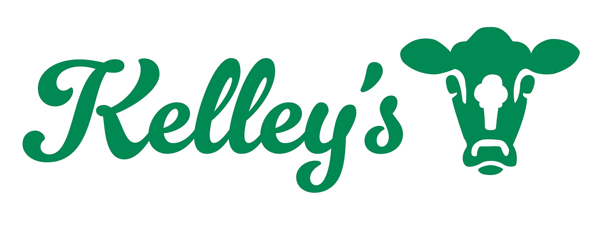
Final Logo
Poster 1
Poster 2
Poster 3
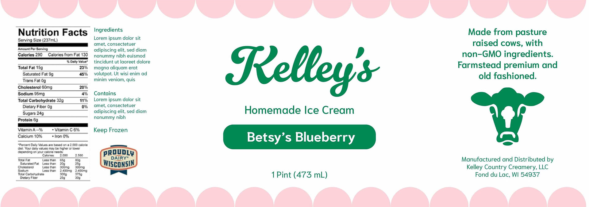
Dieline
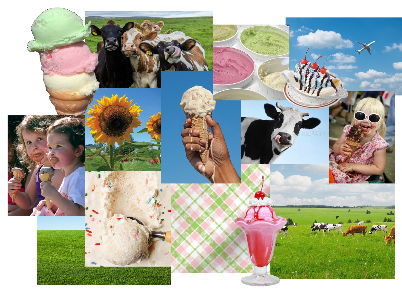
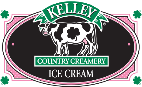
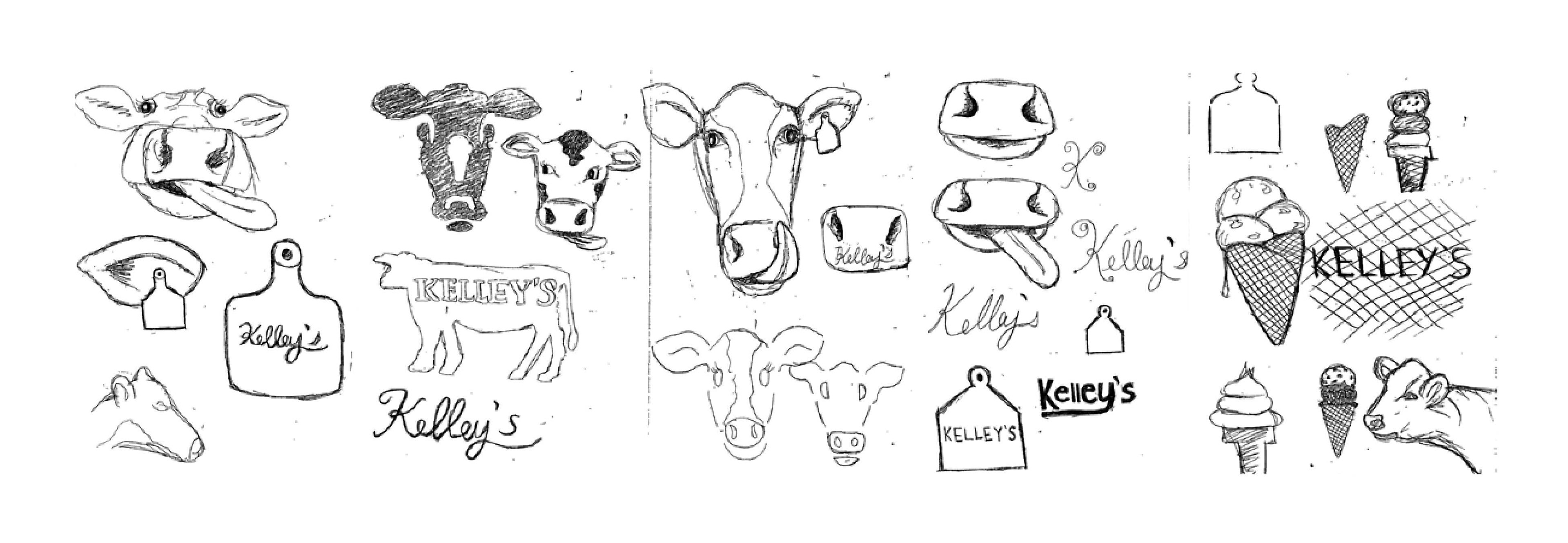
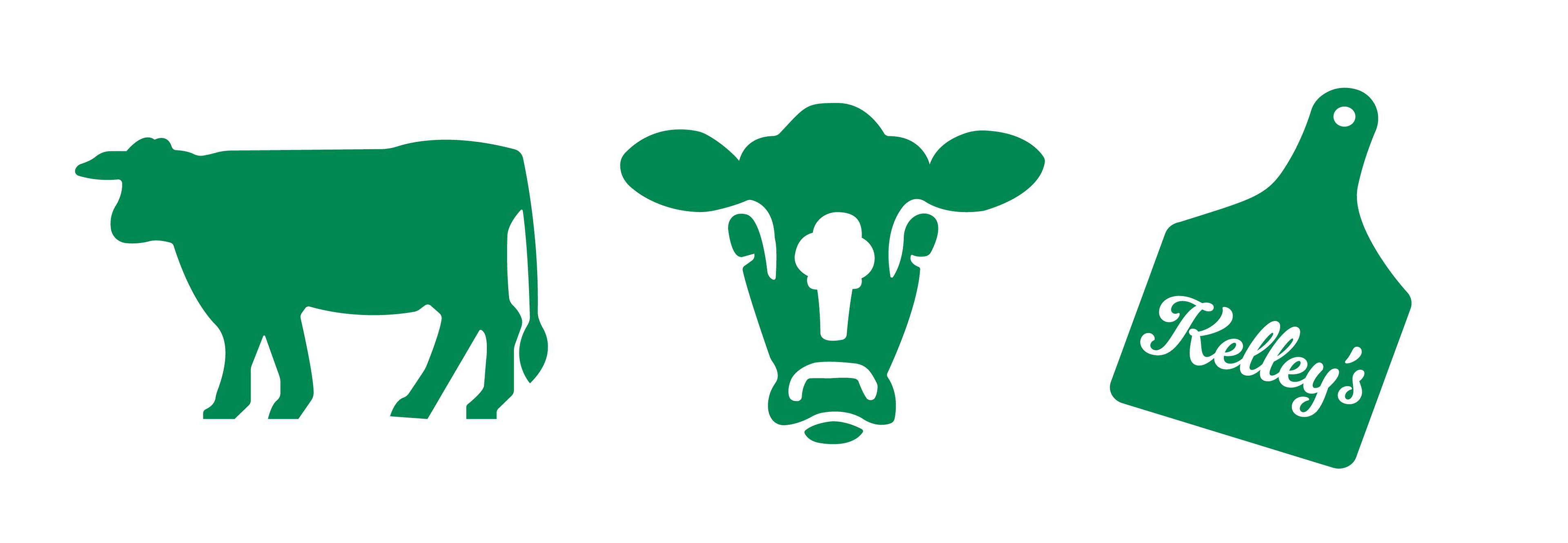
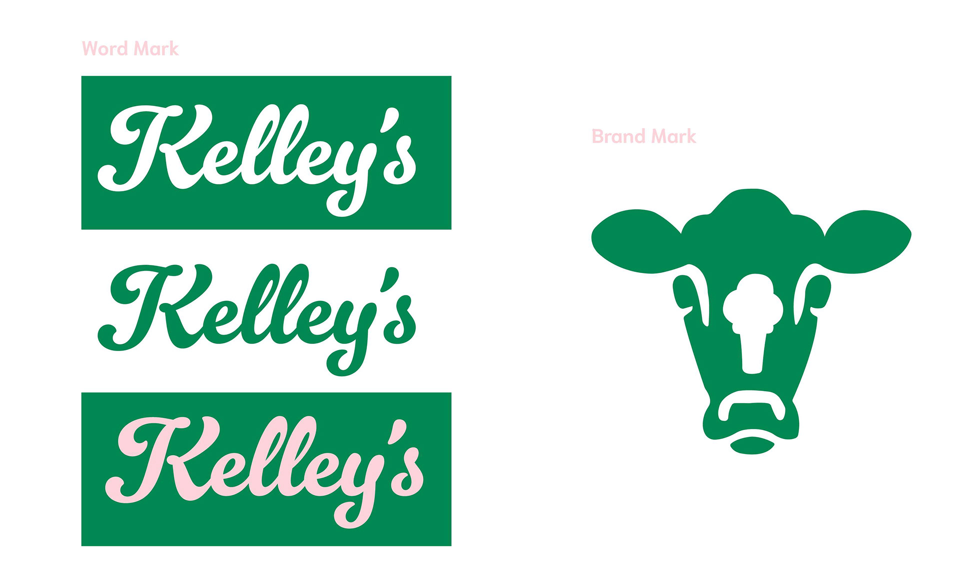
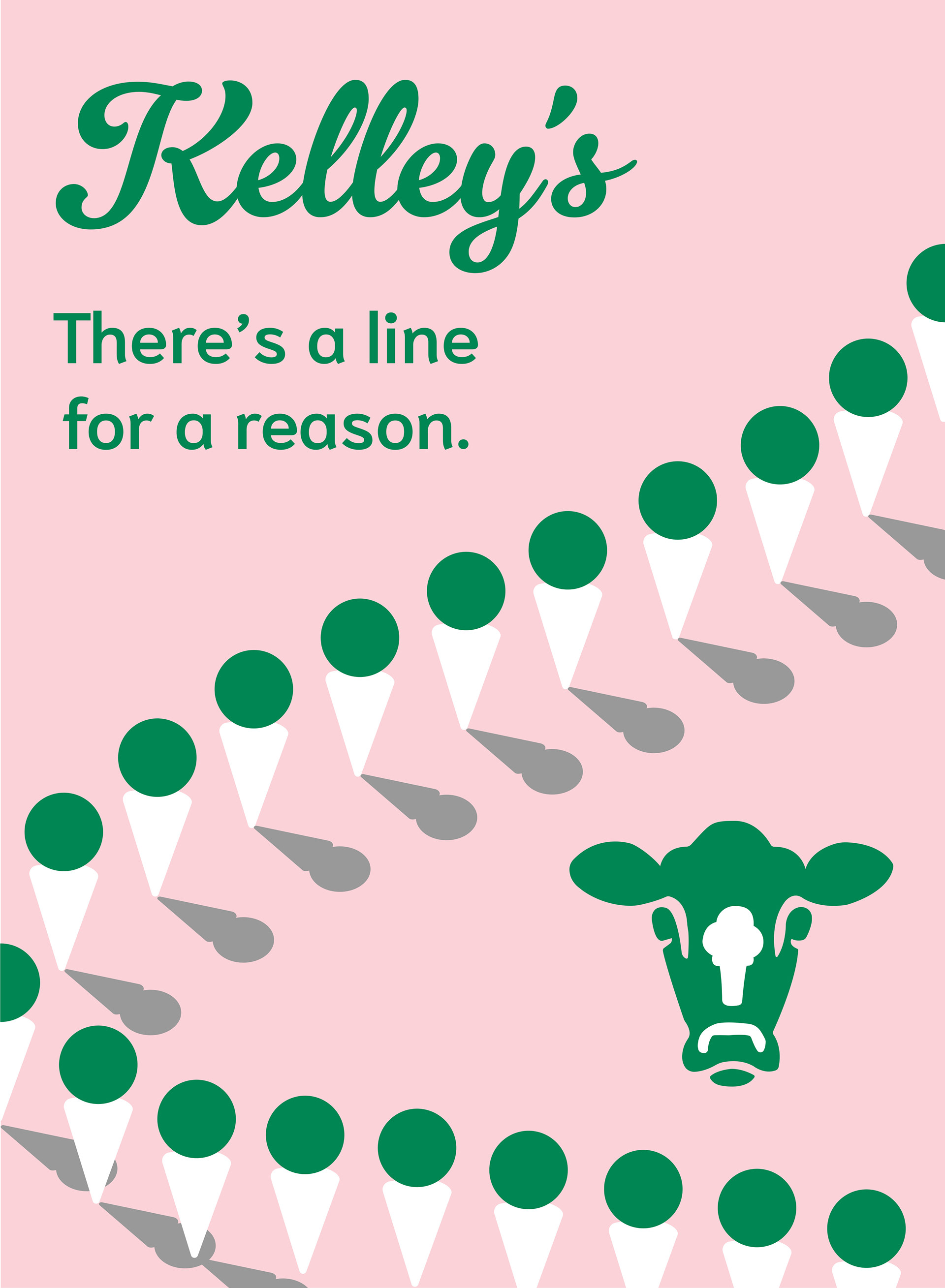
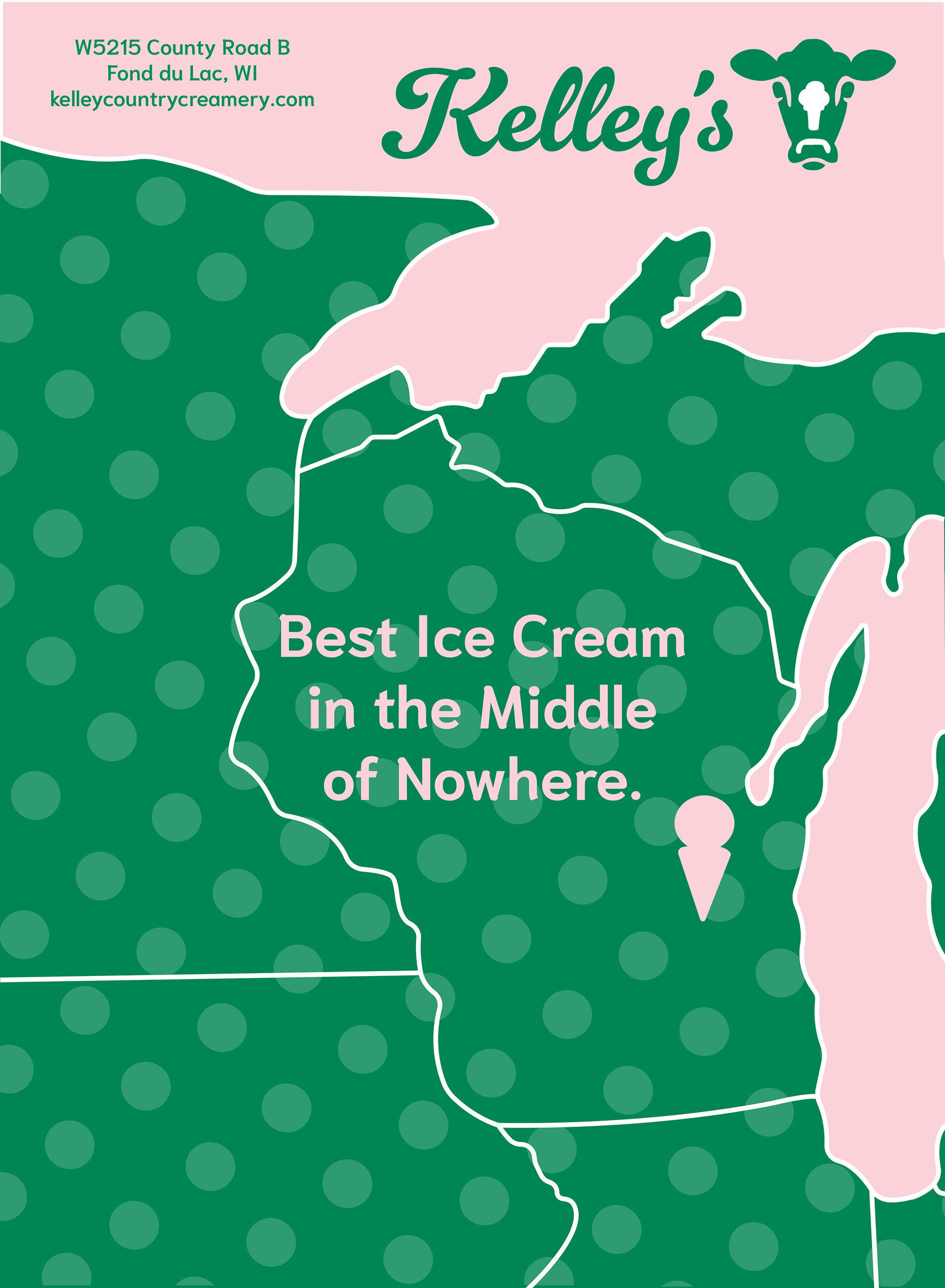
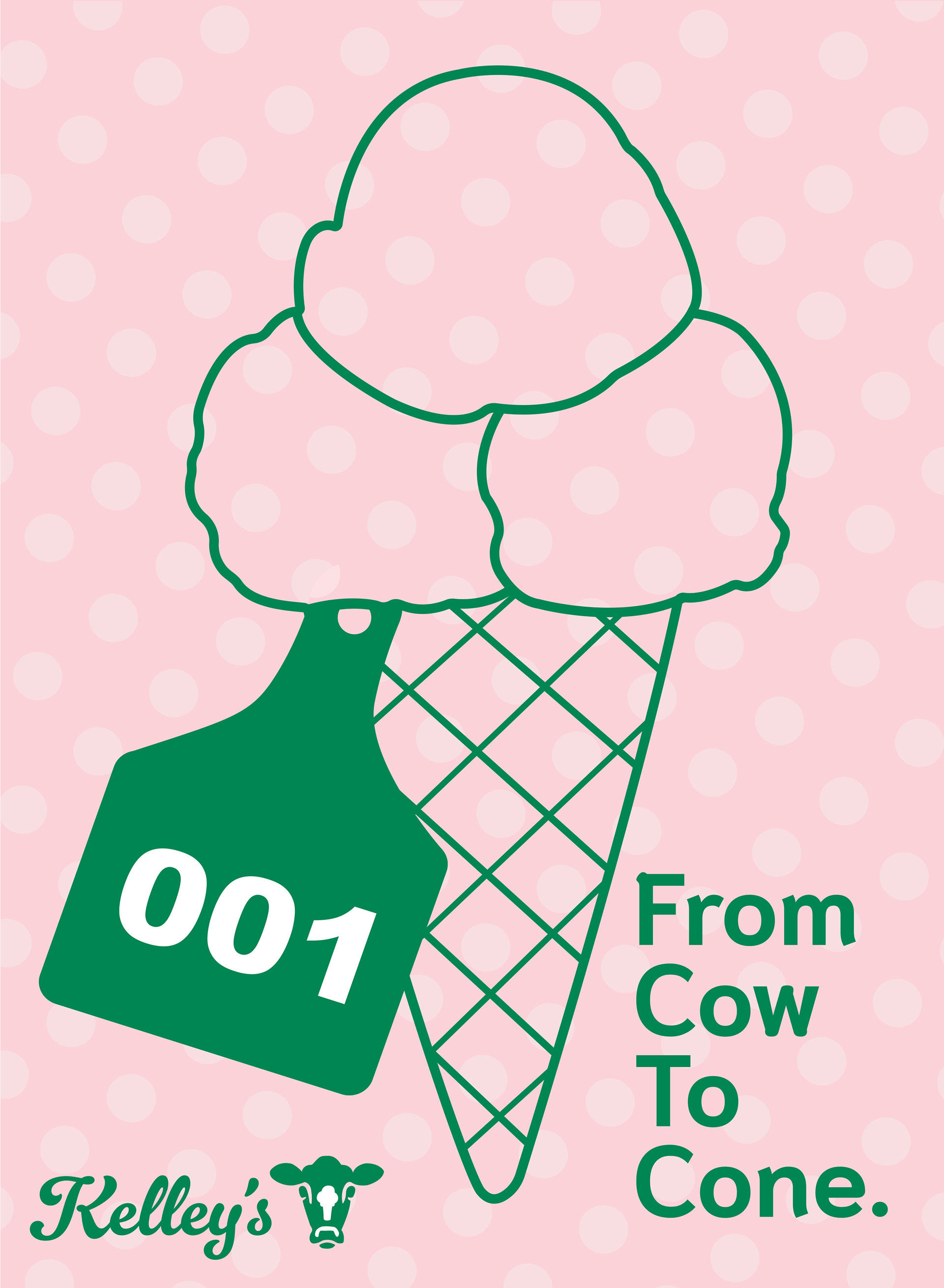
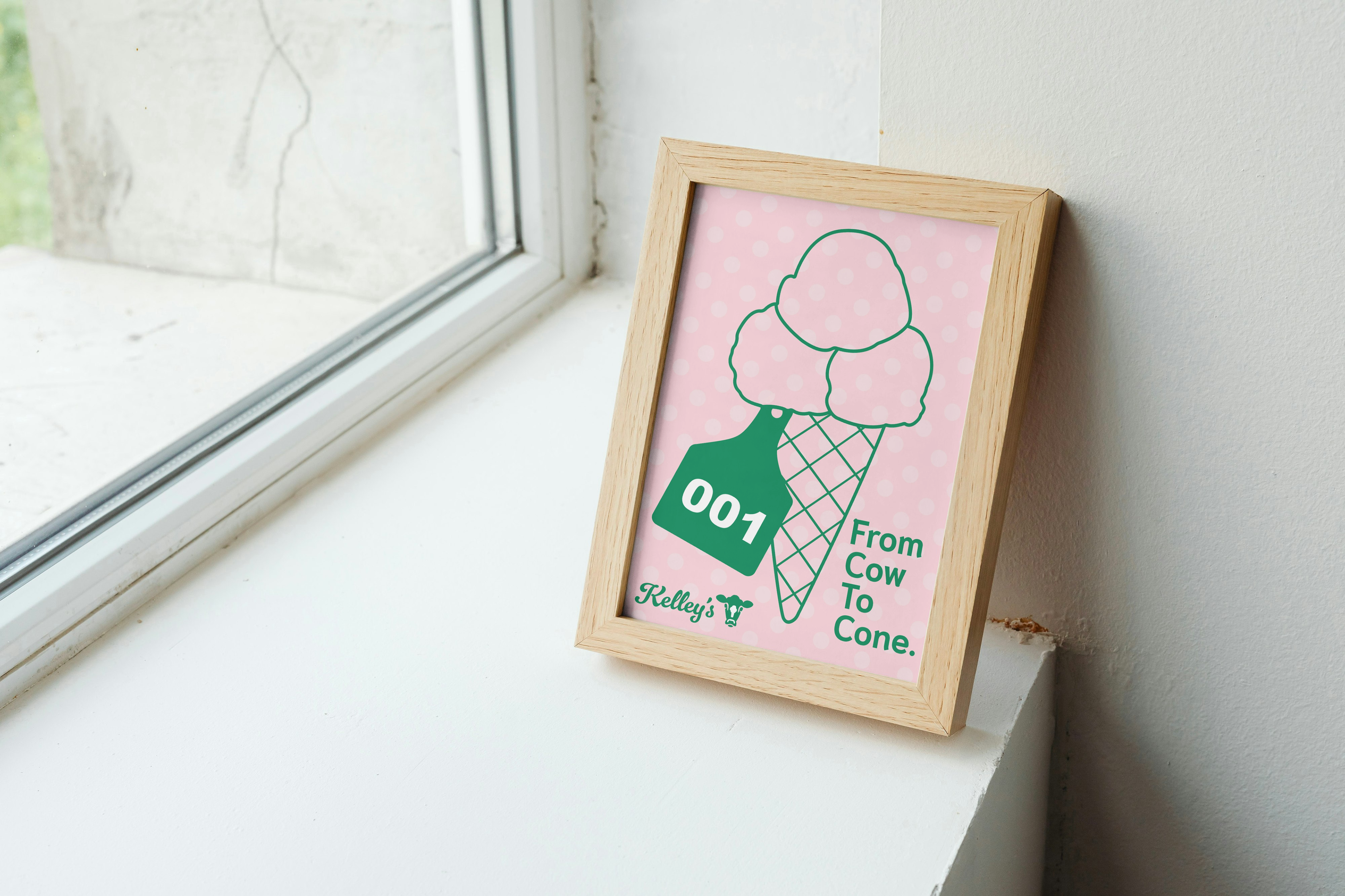
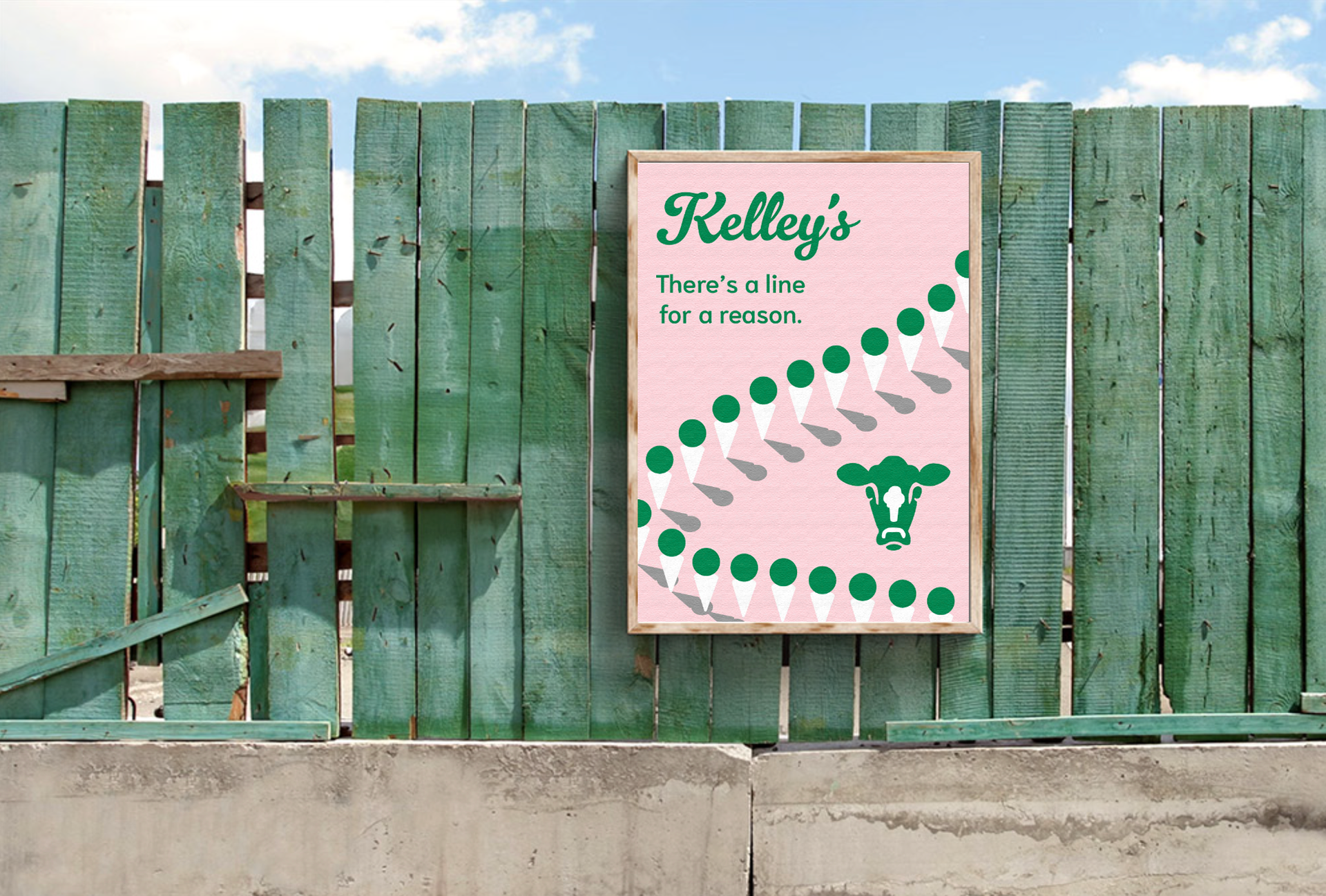
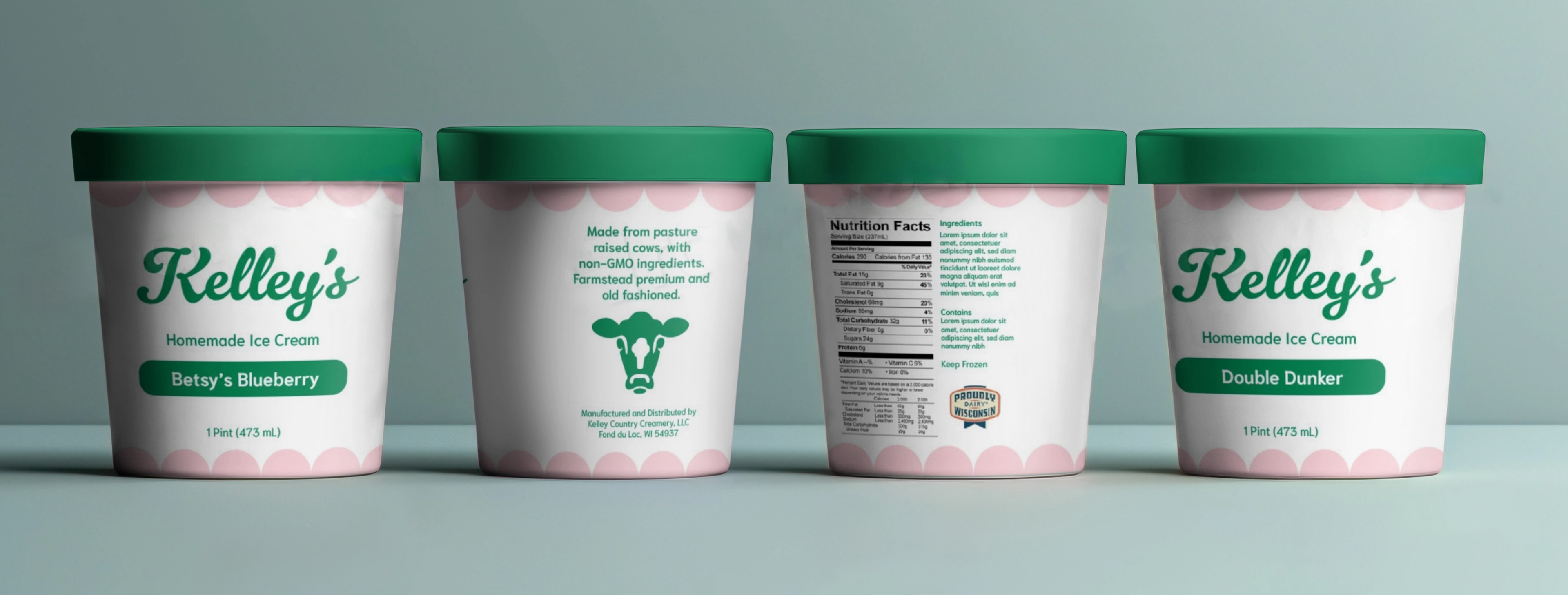
For my final capstone project at FIT, I was instructed to rebrand a company and refine a few of its assets. I picked Kelley Country Creamery, an ice cream shop in Wisconsin. Locals refer to the shop as “Kelley’s”, which is why I shortened their name in the new logo I designed. I created a new brandmark that combines a cow and an ice cream cone. Kelley’s is located on a dairy farm where they make their own ice cream. The brandmark symbolizes their location, product, and commitment to farm-fresh food. I also designed a set of three advertisements. Kelley’s is infamous for having a line wrapped around the shop, which is the inspiration for poster 1. People travel across the United States and even internationally to visit Kelley’s. There is a world map inside the shop where travelers mark where they came from with a pin. This is the appeal of the second poster, as it alludes to this map. The third poster emphasizes the homemade freshness of their ice cream. In addition, I designed new packaging for their ice cream pints using the new colors and patterns I created.
Exploration
Final 3 Concepts
Wordmark & Brandmark
Final Logo
Dieline